Friday, May 13, 2011

Friday iPhone Dump


I think I LIVE for Fridays and the weekends!!! Don't get me wrong, I love my job, but there is just something about waking up on Saturday and having the whole day ahead of you to do whatever you please. For us this usually entails a morning walk with Max to Lincoln Park (the proclaimed dog park) so he can hang with his buddies and run off some energy. We always take a pit stop to P&C Market to grab coffee and a fresh pastry, and then sit and watch as all the various neighborhood dogs play as we read our New York Times (The NY Times Weekend edition is fantastic!). I told Ron the other day that if this Saturday morning routine is the peak of life, I'm content:)


I also wanted to leave you guys with some pictures I recently took during one of our walks. The spring season on Capitol Hill is so alive with blooms around every corner. The residents here really take pride in their postage stamp-size yards, and I can never get enough of the colorful spreads. I came across this fuchsia the other day and was mesmerized.

The fuchsia that have yet to bloom remind me of pom-pom fringe or a Japanese lantern. I love how delicate they are yet bold in color - what a combo!


Isn't this amazing how it unfolds when it blooms? It looks like the roses you see on Harris Teeter birthday cakes (I always requested a rose when I was young when the cake was being cut!) Nature continues to put me in awe and it's such a great source of artistic inspiration. Whenever I am stuck on a project, I often head out the door for a run or walk to clear my head, and almost 9 out of 10 times I come back refreshed and with solutions and new ideas.

The last photo is from the recent DC Design House. Photos are permitted, but I snuck this one in. How I would love to have a room like this in my house (the Roman shades were made of burlap!). I can imagine returning from our Saturday morning walks and cozying up on this chaise to finish reading the paper.


I hope you all have a great weekend! It's suppose to rain here this weekend, but I think the Mister and I are going to take advantage of staying indoors and do a little tweaking around the house!


Wednesday, May 11, 2011

A SNEAK PEEK!

I thought I'd give you a sneak peak of a project underway. We have just started to implement the design plan, so I'll share some photos of the progress so far.

This particular project entails redoing a dining room, living room, hallway and bedroom. We recently had the dining/living room area and hallway repainted including the stairs. It's amazing the difference just a little (well, relatively speaking) paint makes. My clients live in a beautiful row house on the Hill (with their absolutely adorable kids) that has most if not all the original architectural details. We are bringing in a new color scheme to the down stairs, hence the paint job, and we thought we'd give the stairs a little face lift as well.

Here is a shot of the fabrics and colors we are infusing in the new spaces.


As I mentioned before, these clients live in a beautiful row house with traditional details. However, their personal taste leans a bit more toward a modern, clean lined aesthetic. In order to mix the two styles (I believe that the architecture of a home needs to not necessarily match the interiors but they need to "speak" to each other) I selected a beautiful botanical embroidery that is a stylized, fresh take on the traditional botanical prints. I then paired the botanical with a great, textured, strie woven orangey/red fabric and pulled out the blue with a plain, woven accented with a graphic Greek Key trim. I can't wait to see these applied and in the room -stay tuned!

STAIRS BEFORE: I thought I had a picture, but I realized I didn't take one! Just imagine a walnut brown stain on these stairs....

STAIRS AFTER:


We are adding a sisal stair runner bound in a coral/red color, which will really pop against the black and white!


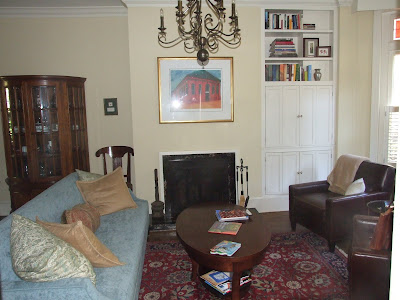
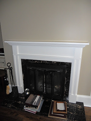
I also had two custom mantles designed and installed for this same client. When I first met with them, they had a fireplace in both the dining and living room areas downstairs but with no mantles. Now, they have a place to hang stockings!

FIREPLACE BEFORE:


FIREPLACE AFTER:


Adding a mantle really finished off the fireplace and gave the room more stature. There is a matching mantle in the dining area to the left of this one.

So that is a little teaser for now as there is more work to be done before the project is complete!