It's been a year since we purchased our house, and this time last year the Mister and I were sporting goggles, masks and crow bars knee-deep in dust, sweat and lath and plaster as we began to gut our house. Oh, how I don't miss those days. I love that we put blood, sweat and in tears into renovating our home as our house feels somewhat like someone we took under our wing, cared for it and helped transform it into the person it was meant to be. However, aside from the sentiments we feel, we are so thankful that we can spend this summer enjoying our hard work and actually see the sun!
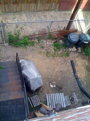
Although phase 1 is over, we are now embarking on phase 2 which includes smaller interior projects (replacing doors, hardware, adding bookshelves, etc.) and focusing on the front and back yard. It's been a bit of a tease for us as we walk around the neighborhoods oohing and aahing over our neighbors beautifully maintained yards with bouquets of every flower imaginable and then returning home to this (prepare yourself, it ain't pretty):
If you can believe, it looked worse about 3 weeks ago until the Mister took a jack hammer and removed the broken sidewalk/patio that was back there along with pulling up arm fulls of weeds. I actually felt encouraged by the scene above once all that was done.
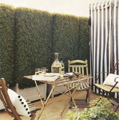
I am thankful that God gave me vision as I think a lot of people would give up on a backyard like that. I do envision a space where we can sit outside on summer mornings, drink our coffee and read the paper and entertain late into the night. I've come to realize that living in a row house in the city where your neighbors are literally attached to you on either side creates an intense desire to have an outdoor space where you can stretch your legs and breath a bit. So we plan to build a wooden fence around the perimeter adorned with ivy and other vine-like plants, and then either brick-in the space or use stone. Grass isn't worth it for the small space we have. We plan to remove the current rusty stairs and relocate them alongside the house to create more space. So by the end of it our yard will look similar to this:
(via Domino)
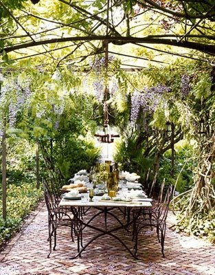
As I was brainstorming about our backyard plan, I came across a few other images I had to share of outdoor spaces that were incredibly inspiring.
(image unknown)
I love the intimacy of this dining area. It reminds of Alice in Wonderland.
(image unknown)
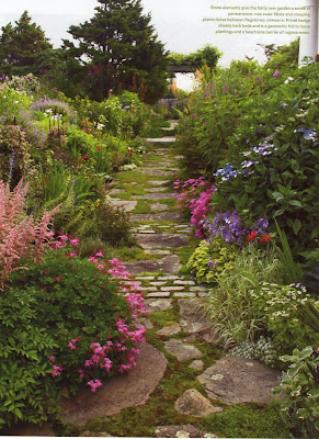
(via Veranda)
Clever use of strategically sized and placed stone to make this garden seem ancient.
(via Veranda)
LOVE the potted hydrangeas lining the driveway - brillant! I plan to do this at our future home in the country - ha!
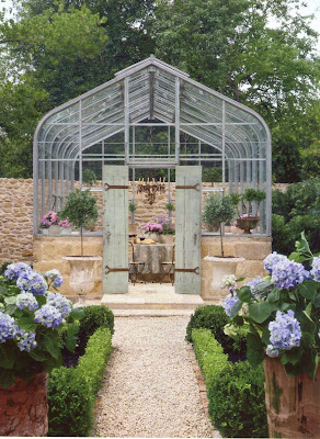
(via Veranda)
I have a brown thumb so this is the perfect use of a greenhouse for me!
(via Elle Decor)
You can never have enough arches in a garden.
(via Costal Living)
And this is what I plan for our future house on the Mediterranean. I'm sure I'm giving the Mister a heart-attack by now:)


