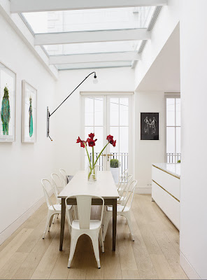
I'm back! Last week was a like a dream, and I can't wait to share with you a few photos and stories. However, getting my to-do lists crossed off at work is priority, so I'm going to have to wait until this evening to get my photos loaded, etc.
We arrived back in the US on Saturday night, which meant I had all day on Sunday to rest, do laundry and read the Sunday NY Times, which is always one of the highlights of my weekend. I do thumb through all the sections, but I never miss the Style, Travel and NY T Style Magazine. Those sections I read front to back, and I always am wanting for more. The writing is fabulous, and it's the perfect way to provide me a surge of inspiration before I jump into the work week.
Yesterday I came across a fantastic article featuring the London town home of designer Harriet Anstruther. Her home is similar to mine in that it consists primarily of a black and white scheme with pops of color. When planning out our renovation, I knew I wanted to do a similar scheme and make our home "graphic." Harriet puts in well in her explanation of why she went with white, " Clarity keeps me calm. I like the architecture to be the story, and [white allows you to] to see the silhouette."
Many people are afraid of white walls, fearing the look will be too sterile or look "unfinished." However, I've never strayed from considering white as a color option for the wall. It can provide a blank canvas for art, colorful furniture or beautiful patterns. They tend to leap out of the interior space and act like a punctuation mark. Here are photos of her house to prove my theory....

I NEED that watercolor painting


all photos via NYT Magazine

No comments:
Post a Comment