See you in the new year!
Friday, December 24, 2010
Monday, December 13, 2010
Christmas at the Iveys
We kicked off the Christmas season with a little party thrown at our house Saturday night. Ever since I was little, I've been obsessed with the 1940s, '50s and '60s. Talk about a child born in the wrong decade. I even had a huge crush on Elvis when I was 12. I have no idea where this love came from, but I always have loved the glamour and the air of formality that followed in those decades. Women took time to dress up, parties were top notch and the music during that time was fabulous. So I tell you all this because we decided to have a theme with our party - "Festive and '40s." We asked everyone to dress up in their best 1940s Christmas attire, and we had Ella Fitzgerald, Louis Armstrong, Louis Prima and the like serenade us into the night. Our friends really got into it, and the last person left around 1 am! Sadly I didn't take a ton of photos as I was having too much fun, but here are a few:
(me and Meriwether)
(Laura and Amanda)
(the dapper Gatewoods and Meriwether)
(Rita Hayworth, Grace Kelly, and Katherine Hepburn)
(Collins, Cassidy, and Austin)
The weekend before we spent getting the house decorated. We got our Christmas tree from a great farm out in Round Hill, VA called Snickers Gap. It's a beautiful ride out to the countryside, and the farm provides you with a saw and rope. Then you can either take a hay ride out to the trees or just walk to find your perfect tree to chop. I went with a Blue Spruce this year because I loved the color of it. However, I don't think I'll go this route again as the needles are extra sharp. We had to wear gloves when decorating the tree!
I decided to go simple with our decorations this year, as the renovations took it out of me. I did a simple garland going up the stairs, garland on the front door along with a wreath on the front door and wreath over the fireplace. We weren't able to get our fireplace and mantel fixed in time, so next year I look forward to hanging stockings. It's amazing how just a little Christmas greenery makes a house light up. I wish I could keep it all year round!
Wednesday, December 8, 2010
TERRAIN
I'm pretty sure I'm not alone when I tell you that I can spend hours in Anthropologie. Between their fabulous clothes, quirky home goods and genius visual displays, time easily escapes me. I try to add a few pieces from the store to my wardrobe a couple times of year, but I consistently go back to see what kind of new baubles and what-nots they have in their home section to bring home with me. So, I was excited when I heard that the over arching company Urban Outfitters, Inc. (who owns Anthro, Free People, and Leifsdottir) has started up a new lifestyle brand, Terrain, which hones in on home and garden products.
Since I have not visited Terrain (yet), I did a little Google research and found some photos from the great blog Oh Joy!. You can go to her blog and read in more detail about this little jewel.
(image via OhJoy!)
Their flagship store is located right outside of Philadelphia, and my friends Melissa and Ian had the opportunity to pop by. They came home with beautiful poinsettias and a gorgeous arrangement of paper whites.
Here is what my wish list:
I think this calls for a weekend trip to Philly soon so I can see what all the hype is about. I know I won't be disappointed!
Tuesday, December 7, 2010
An Early New Year Resolution
Where the heck have I been you ask? Busy. Plain and simple. I do hate that my blog posts have been so infrequent, but the good news is that I've been busy with client work. I also just returned from hearing Micheal Boodro, the Editor-in-Chief of Elle Decor magazine, speak at the Washington Design Center this morning. He spoke about Elle Decor's efforts to keep up with the new-media frontier aka. the Internet and the demands that the Internet puts on the design world. Let me tell you, it was a kick in the pants for me!
With the so many great design resources online now, both clients and designers have inspiration and resources at their fingertips. Immediacy and instant gratification are the new expectation. I have a whole other post to write about that, but just note that for now. Elle Decor is staying ahead with their recent revamp of their web site Elledecor.com. It now offers "look books"of different rooms, links to popular articles that are in their current issues, archives, and even a Designer Registry where a potential client can search within their area to find a designer that fits their needs - this is obviously a great tool for the designer to in reaching out to new clients.
All this got me thinking. I'm on Facebook, I try to Twitter, and well, I struggle to blog. Michael's lecture has put a fire under my rear, and I'm publicly committing to blog and Twitter at least 3 times a week. I think that is fair. I am a designer first and foremost, so my client work takes priority, but I also desire to share with you my projects, resources, and experiences. I've got some exciting projects to share in the near future plus some past experiences I need to post. So stayed tune. I promise!
Wednesday, November 10, 2010
Font Fun
So I was estatic when I came across this awesome, easy to use new online tool that allows you to write in your own personal alphabet using your own handwriting style to create a personalized font that you can use to send emails. The website is called PilotHandwriting.
You simply print out a template, write in the letters, then scan/or photo the template, upload it to the computer and voila! Your own font. Here is the how-to video:
Here is what mine looks like, although I think I wrote them in too small:
Now I just can't get distracted all afternoon creating new fonts!
Wednesday, October 13, 2010
William Yeoward
Several weeks ago I attended a presentation/book signing at the Washington Design Center starring the British designer, William Yeoward. Yeoward was in DC to debut his third book, William Yeoward At Home, which takes the reader through his home in the Cotswolds and his urban flat in London. Both homes are filled with his fine crystal and beautiful upholstery and textiles. He was also here to debut his furniture line now available to the US!
I was not very familiar with Yeoward before he came to Washington as all his designs were sold only in the UK. However, he has recently established a relationship with Edward Ferrell + Lewis Mittman to bring his products to the US and, they are available to the trade through showrooms in NY, Atlanta and DC.
William Yeoward at the EF+LM showroom
William is not only a charming Brit (his presentation was hilarious!) but an amazing designer as well. His humble philosophy of what makes good design makes me want to buy as much as possible from him. He began making furniture because he didn't have the means to buy expensive, hand-crafted furniture, so he thought, why not just try his hand at making it!
His designs have a unique quality that balances a respect for the British traditions with a modern, whimsical approach to the design. I'm actually using his Asti Extending table in a current project of mine, and I'm excited as it was the perfect table for the project. I've posted several pictures of his items below that will give you a good sense of these cheery designs.
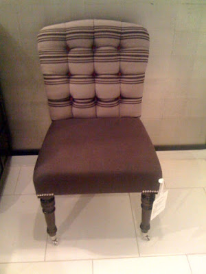
A chair with some personality! I love the lines and how the curves of the top are repeated in the cushion and seat of the frame. Leave it to William to take "paying attention to detail" to another level!
Love the scale of this chair and the use of mixed patterns.
This handsome table is the one I'm using for a client project. Isn't he dashing? One of Yeoward's crystal lamps on top - truly a work of art.
I can just picture this as a banquet for a dining nook. Perfect proportions.
This is a chair you could sit in for hours around a long meal with lots of wine.
Another fabulous crystal lamp.
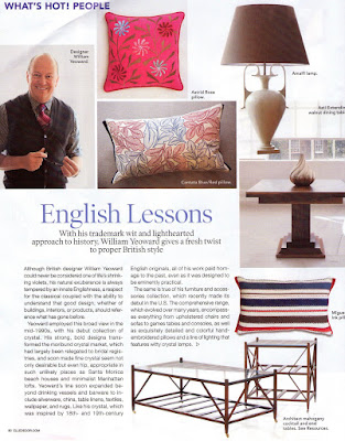
Also, the most recent issue of Elle Decor highlighted Yeoward and his new US presence.
Tuesday, September 28, 2010
Come On In!
Well, I've finally taken a few shots of the house since phase 1 has been completed. I say phase 1 because we have about 5 more phases to go (my poor husband:). I do have to put in a disclaimer that these shots are not styled, our house has a long way to go, and I only had a few minutes to take these pictures so they are not the best. I feel a bit vulnerable opening the door for you all. It feels a bit like an artist showing a painting that they haven't finished yet, but I guess a house is like a painting in that it's never done and always evolving. However I had a lot of you ask to see updated pictures so here it goes:
Here is the front of the house. We still need to do some more landscaping, but mulch comes in handy when you don't have much time and your first house guests are showing up in a few hours! If you don't remember the "before" photo, the house was painted red with peeling paint.
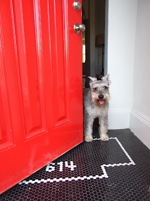
Max likes his new digs and loves visitors! Here is a shot of the finished tile work - I love it! It's perfect for muddy paws and shoes.
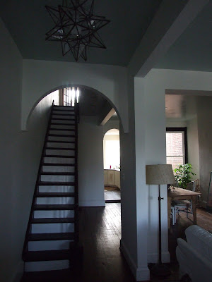
The "foyer" - I was so excited to get my star light hung - this is one of my favorite pendants! The design of it fits a variety of styles. We plan to get a radiator cover made for the hall so we can have a entry table with a mirror - a place to drop keys and make sure your lipstick is on straight before heading out the door!
Here is another shot of the front hallway. I chose to paint the stairs black and white to add a graphic punch to the entry. Stairs are a great place to have a little fun.
The living room - This isn't the best photo as I was in a bit of a hurry. I know some people think it's crazy to have all white furniture with dogs and future-kids, but you CAN do it when the furniture is slip-covered. I'm a believer that you shouldn't be afraid to use your furniture. Let's be honest, no one lives in a showroom.
We are going to put in built-in bookshelves on either side of the fireplace that will house all our books and our television. I'm on the hunt for the perfect piece of art to hang above the fireplace. For the mantle, we are going to put up a simple, reclaimed wood mantle. Our house has clean, modern lines, but I wanted to warm up the interior by using lots of natural materials, so this type of mantle fits the bill. Here is an example of what we are going after:
The dining room - We still are in need of furniture for the dining room. Again to go along with the rustic yet simple design I chose a farm table for our dining room. Our house is not formal, and I've always had visions of enjoying dinner around a long farm table with friends packed in like sardines. I am still looking for a sideboard so I can put up a mirror and lamps, and I need a set of 8 chairs. For now, the dining room houses my bike:) I think the bike is an accessory itself!
This French lantern is going over the farm table. Unfortunately it's been back ordered 3 times! Good things come to those who wait.
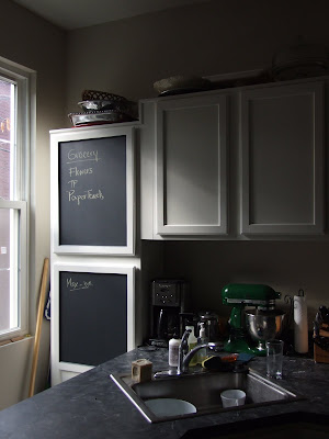
The kitchen - The orignal kitchen had new cabinets and new appliances, but the cabinets were oak and the floors were old linoleum. I couldn't wait to change this room! While we were gone on vacation, we had the walls painted Benjamin Moore's Edgecombe Gray and the cabinets White Dove. It's amazing how paint transformed this kitchen! We also getting rid of the table in there and putting in an island/bar. The design of the kitchen is not ideal for cooking, so to save money I'm adding an island that will provide more prep space but it will also be a place for friends to pull up, sit and chat.
I also had the painters pull down four cabinets because we are adding open shelving on the large wall space below.
Chalkboard paint...gotta have it!
The office - I'm just showing you the office upstairs as the bedrooms are not ready at all for any type of reveal. Our guest room is housing all our books in boxes until we can get the bookshelves built and the master bedroom, well, I'm having a creative block with that room.
This room is where I work most of the time, but I do share the space with the Mister at times so I couldn't go too feminine. I wanted a cozy room but still something creative and playful. It's still a bit of a mess as I we haven't fully organized it yet. I need to find another desk for the Mister as he is using the small drop-leaf table for now.
Again, gotta have the chalkboard paint!
I love sitting by the window as I work. There is something psychological about being near a window in a room. My desk is a mess - don't judge.
So there you go! We still need pictures hung, pillows to buy, and a few more minor construction projects, but I'll make to sure to post our progress.
Friday, September 10, 2010
Avery Art
I'm back from our relaxing vacation but jumped right back into finishing up some last minute house projects, hosting some of our favorite friends for Labor Day and picking up more a few more client projects. I think I need another vacation!
I was going to take some more shots of the house today, but I've got our floor guys here finishing up the shoe molding so rather than dodging around them to get the best shots, I'm gonna have to leave you waiting just a little bit longer...I'm sorry!
However, I did want to share with you a wonderful art dealer and resource that has recently relocated to Washington, DC. I met with Evelyn Avery of Avery Fine Art yesterday in her new, permanent showroom on M Street in the West End building. Evelyn is a wonderful, Southern soul with a fantastic eye for art and framing. She used to be based out of Atlanta and traveled to DC a couple times a year where she held a temporary showroom space at The Willard Hotel. However, DC came a' calling and she is now full-time here in the nation's capital!
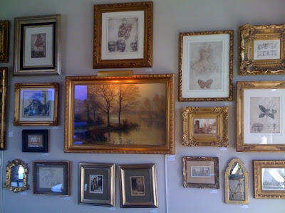
With Evelyn's discerning eye for great art, she collects prints, paintings, and photographs of some of the most beautiful art. Not only does Avery Fine Art provide the art, they also are experts in custom framing. They have a wide arrangement of custom, handmade frames that can be fit to any piece of art whether it's an Avery piece or a priceless piece of your own. I look forward to using Avery Fine Art for potential clients!
A great variety of subjects.
Old Japanese Textiles. This series would a great punch of color to any room and add patina.
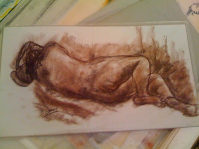
Beautiful nude. This would look exceptional in a bathroom or bedroom.
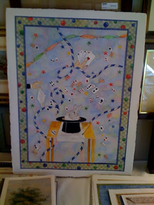
Watercolor art work for a kid's room.
Gorgeous handmade frames. A beautiful frame can really bring out the best in a piece of art.
Evelyn informed me they are branching out and doing headboards as well. Here is a classic queen-size headboard she created.
Subscribe to:
Posts (Atom)