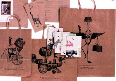
 I've read a few things about the wonderful, whimsical cafe in NYC called Moomah, and I've always thought it was a brilliant idea. I just read over the weekend in the recent HOW magazine they that have won an outstanding award for their letterhead/branding. I couldn't agree more with HOW. The design firm, Apartment One, based in Brooklyn is responsible for the eclectic, imaginative images stamped on Moomah's retail bags, coffee cups, business cards, letterhead, etc.
Moomah describes themselves as a "creative arts cafe for parents and children." Founder, Tracey Stewart, says it's "a place where imagination is king, where we are inspired by our children and we hope to be able to inspire them teach them that anything is possible."

Moomah's mission is to be a place where kids and parents can connect, discover, nourish and create. They even go so far as to creating the cafe menu to be an opportunity where kids can discover new, healthy foods. They present the meals in fun designs to entice kids to dive in, regardless if it's spinach or brussels sprouts!

I would love to find out who designed the interior of the space. The cafe's interior is an inviting atmosphere that encourages the patrons to come and play. There is a hint of an industrial feel with the factory lighting and the impenetrable counter tops. Kids feel the freedom to roam and not have to worry about breaking anything or "accidentally" creating a piece of art on the table.

I just wish we could get Tracey to put a Moomah location here in DC. I have so many friends that would love to take their kids to a place like Moomah. Gosh...I would want to go hang out myself!
(images via Moomah.com and HOW)

No comments:
Post a Comment